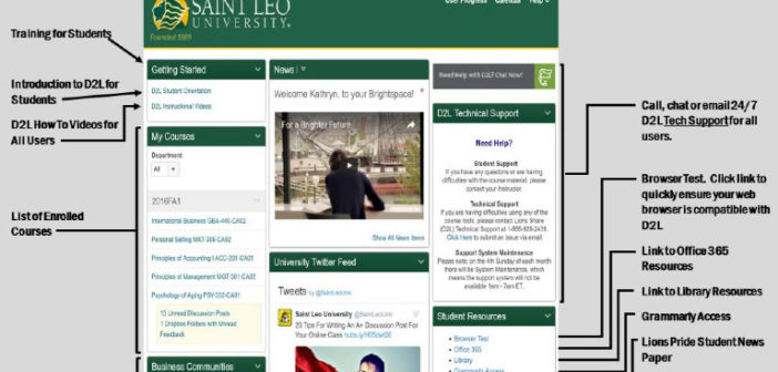
At the end of the spring 2018 semester, scrolling marquees heralded the arrival of an updated Courses section for the platform “Desire 2 Learn (D2L).” Sneak peeks were allowed for users to see what their courses would eventually turn into, as Daylight was fast approaching. The new look of the Courses page layout is a shift in what the company deemed as an easier, more functional and better-looking design.
These statements were reiterated by Assistant Vice President for Learning Design, Dr. Karen Hahn who spoke on the functionality of the update.
“D2L updated their user interface. They did it for a couple reasons, one was it [the initial product]was not a responsive design, so if you tried to use it on your phone it was very difficult, and on your tablet it was impossible. And now it responds beautifully, and students can do their work where it’s comfortable for them, laptop, desktop or phones,” stated Hahn.
Hahn continued, “It also was a change that was more responsive to comply with 508 compliance, for students with disabilities, so both of those reasons is why the company changed it.”
Learning Design according to Hahn has an analytics team that reviews how the courses are functioning, how the students are performing, what are the things students like about the courses and what things students are not using in the courses. So, the analytics team aides the department in understanding what to update in the courses when the time comes.
Hahn explained her portfolio adding, “Another part of what I do is, [hold responsibility]for the Learning Management System (LMS) I don’t do the technical aspect of it we currently have Jamie Birch who is responsible for the technical aspect along with UTS; UTS is a critical component of maintaining the LMS.”
Desire 2 Learn’s website touts the user-friendly interface claiming, “The user experience makes it easy for instructors to design courses, create content and grade assignments. That gives them more time to focus on what really matters: teaching and learning.”
Regarding the timeframe for implementation, Hahn stated, “We set about a 6 to 8-month window, where we did a campaign to let people know it was coming. One week we’d send out an email the next week we’d put it in the news bites.”
During that time Hahn explained that the team took the opportunity to make a couple of tweaks, regrouping tabs into specific categories. By doing so, students could find information easier within their courses.
“When we first took the LMS we sort of took it out of the box, as bought and then over the years of using it we made a few little tweaks of where things were located. But the functionality never changed with Daylight, just the look and feel [of the system],” said Hahn.
Feedback is most important to the Learning Design team as the technology is continually modified for the best user experience. Since its implementation the Learning Design team has continued to work feverishly on creating a more user-friendly environment one example is for course announcements.

Dr. Karen Hahn is Assistant Vice President for Learning Design. Under Dr. Hahn’s direction, her team analyzes the feedback from D2L giving timely support.
Credit: John Hall
“We have tried to keep up with [the feedback received], and one of the issues that we are actually now working on is the announcements. Announcements used to be in a more prominent place than they currently are, so students are missing [some of]the announcements. So, Jamie Birch is coding us a program that will have the announcements on top of the big green bar on the course page. The announcements will pop in there. So, it’ll make it more obvious and apparent to the students. So that is definitely one piece of feedback that we’ve got that we’re reacting to,” said Dr. Hahn.
When it comes to getting acclimated to D2L, Dr. Hahn offered several solutions, “If you clicked on the ‘Getting Started’ tab, there’s an actual video where it has someone teaching you how to function within the course; it’s called Introductions to Courses. Also, frequently asked questions (FAQ’s) has some videos there, [additionally]if you clicked on “Help Desk” you have that video, the intro to courses, guides and then help videos. So, we’ve tried to put the information there. If you weren’t sure which to click on, there’s only five or six icons in that bar; three of them are going to help you to navigate within the course.”
Additionally, for more one on one assistance, faculty and students have further options. “We do have our Lions Share help desk, and they are totally versed in the functioning of the platform, so instead of struggling; click on the help desk or call them and they can help you instantly because they know the platform very well. And so that would be a very [simple option]instead of taking all that time and frustrating yourself call the helpdesk. It’s 24/7, they’re available all the time, and they can help. If you say, ‘I don’t know where to find something,’ they’re going to be able to help you to do that along with UTS,” said Dr. Hahn.
As many are frustrated adjusting to the look and functionality of different programs including D2L, the Learning Design team has in place different mechanisms that allow timely responses.


1 Comment
Hello! I just wanted to ask if you ever have any problems with
hackers? My last blog (wordpress) was hacked and I ended
up losing a few months of hard work due to no data backup.
Do you have any methods to protect against hackers?